Stress Trajectories: Watching Fiscal Health Evolve Over Time
Every city in the NY Benchmark stress analysis now has a trajectory chart showing its FSMS scores over time. Here’s why that matters and what we’re seeing.
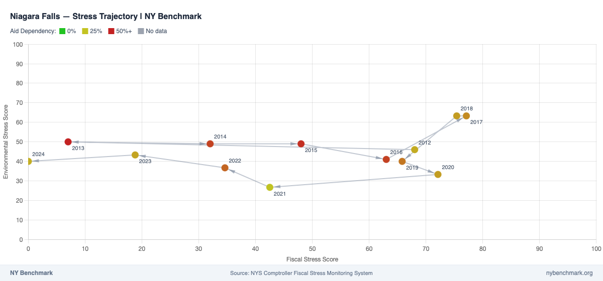 Niagara Falls went from “Significant Fiscal Stress” (score ~75) in 2012 to near zero by 2024 — a textbook turnaround.
A single year doesn’t tell the story
The NYS Comptroller’s Fiscal Stress Monitoring System (FSMS) scores local governments on two dimensions: fiscal stress (fund balance, cash, operating deficits) and environmental stress (population trends, poverty, property values). Higher scores mean more stress — 0 is healthy, 100 is significant stress.
A scatter chart of the latest year gives you a useful snapshot. You can see which cities are under fiscal pressure and which face environmental headwinds. But one year is just a moment. Is a city at 45 fiscal stress getting better or worse? Did it spike from 20 last year, or slowly decline from 70?
That’s what the trajectory chart answers.
How to read a trajectory
Each trajectory chart plots fiscal stress (x-axis) against environmental stress (y-axis) with connected points showing the path a city has taken from 2012 to the present. The dots are color-coded by aid dependency — green means low reliance on state and federal aid, red means high.
Movement toward the bottom-left corner (lower scores on both axes) means improving health. Movement toward the top-right means worsening conditions. The arrowheads on each segment show the direction of change year over year.
Some patterns you’ll see:
- Steady improvement: a clear path from upper-right toward lower-left, year after year
- Volatile swings: large jumps in one year followed by corrections
- Environmental lock-in: fiscal scores improving while environmental scores stay stubbornly high (a city can fix its budget but can’t easily reverse population decline)
- Filing gaps: missing years appear as breaks in the trajectory, common for cities that filed late or skipped a year
What we’re seeing
A few patterns stand out across the dataset:
Environmental stress is stickier than fiscal stress. Many cities have meaningfully improved their fiscal scores over the past decade — better fund balances, healthier cash positions. But environmental scores (driven by demographics, poverty rates, property values) move slowly. A city can right-size its budget in a year or two; reversing population loss takes a generation.
Aid dependency correlates with trajectory direction. Cities with high aid dependency (red dots) tend to cluster in the upper-right quadrant and show less improvement over time. Cities that generate more of their own revenue (green dots) have more fiscal flexibility to course-correct.
Niagara Falls: a turnaround story. As shown in the trajectory above, Niagara Falls had a fiscal stress score near 75 in 2012 — deep in “Significant Fiscal Stress” territory. Over the next decade, the city steadily improved its fiscal position, reaching a score near 0 by 2024. The trajectory tells the story clearly: a long, consistent march from the right side of the chart to the left.
The 2017 methodology change is visible. FSMS switched from a weighted fraction system (0-1.0) to a direct 100-point scale in 2017. We normalize pre-2017 scores to the 0-100 scale for visual continuity, but you may notice a cluster of trajectory shifts around 2016-2017 that reflect the scoring change rather than actual fiscal movement.
Try it yourself
Explore the full dataset — cities, school districts, counties, towns, and villages — on the stress analysis page. Click any dot to see its trajectory, zoom and pan to focus on specific time periods, download charts as PNGs, and expand the data table and indicator breakdown to see exactly which stress indicators drove each year’s score.
Data sources
All scores come from the OSC FSMS, covering fiscal years 2012-2024 for municipalities and 2013-2025 for school districts. Aid dependency is calculated from OSC Annual Financial Report data (state aid + federal aid as a percentage of total operating revenue). See our methodology page for details on data processing, normalization, and known limitations.